


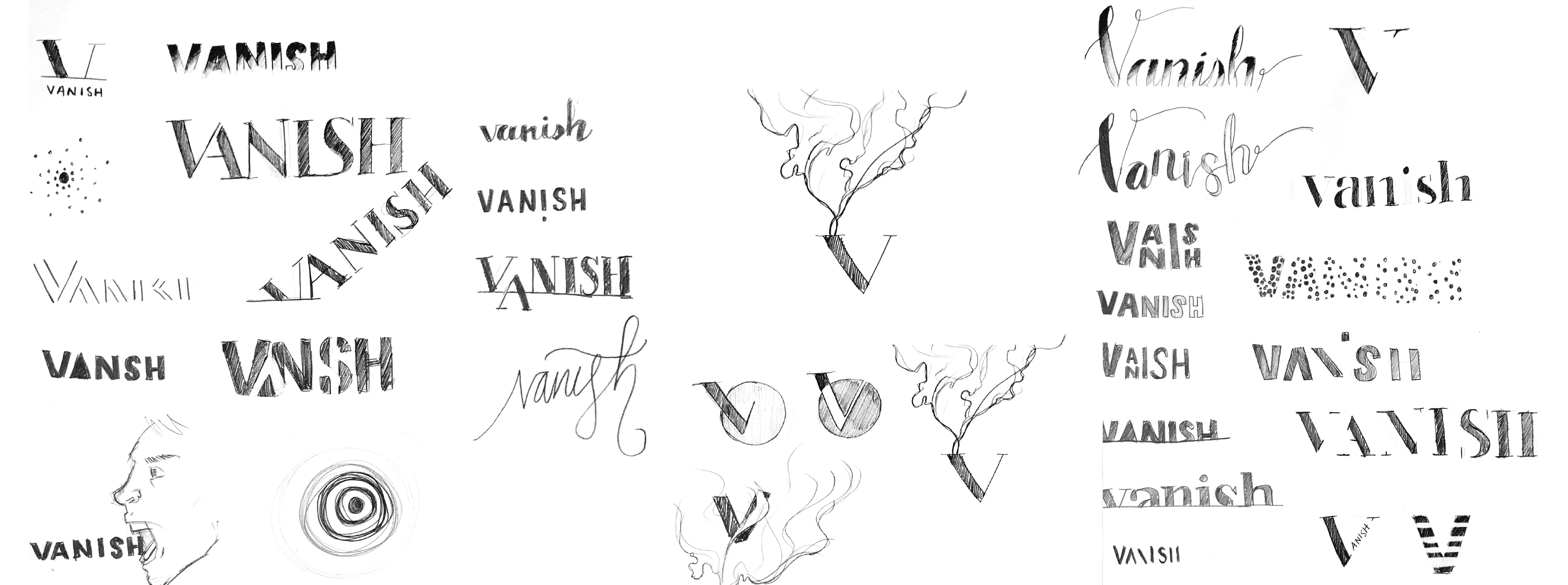
Logo Sketches
While beginning the sketching process for developing the logo, I considered the diverse ways the action of “Vanishing” could be represented. This led to exploration into abstract and literal concepts along with typographic or purely based on imagery.
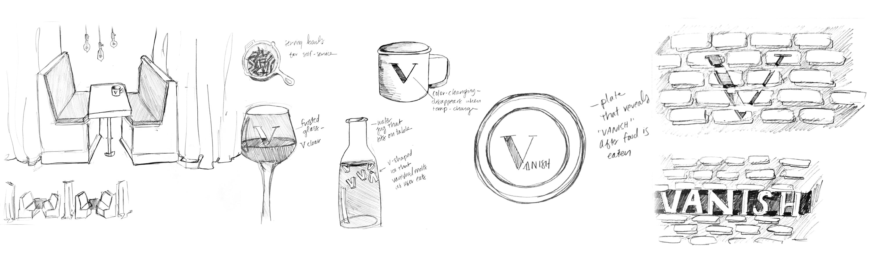
Environmental Sketches
Sketches of the key touchpoints and elements were created that would eventually begin to shape the direction and more granular details of the restaurant.
Logo Development
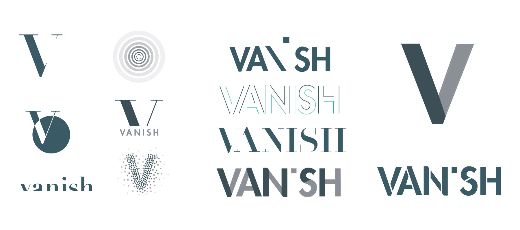
Following lots of sketches and brainstorming, I moved forward with 11 main logo concepts and refined them in the digital environment. I was working toward solution that would to be versatile, as to be represented on many touchpoints, and instantly recognizably vanishing visually.
Brand
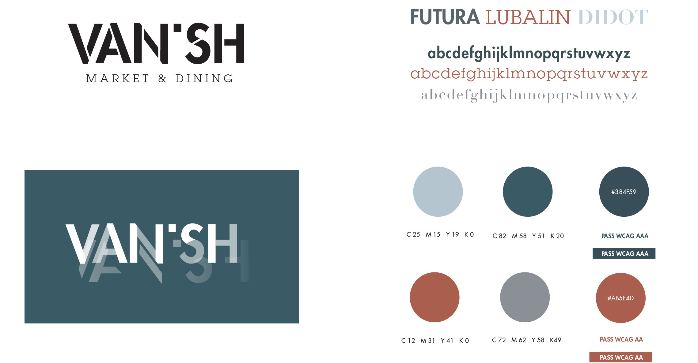
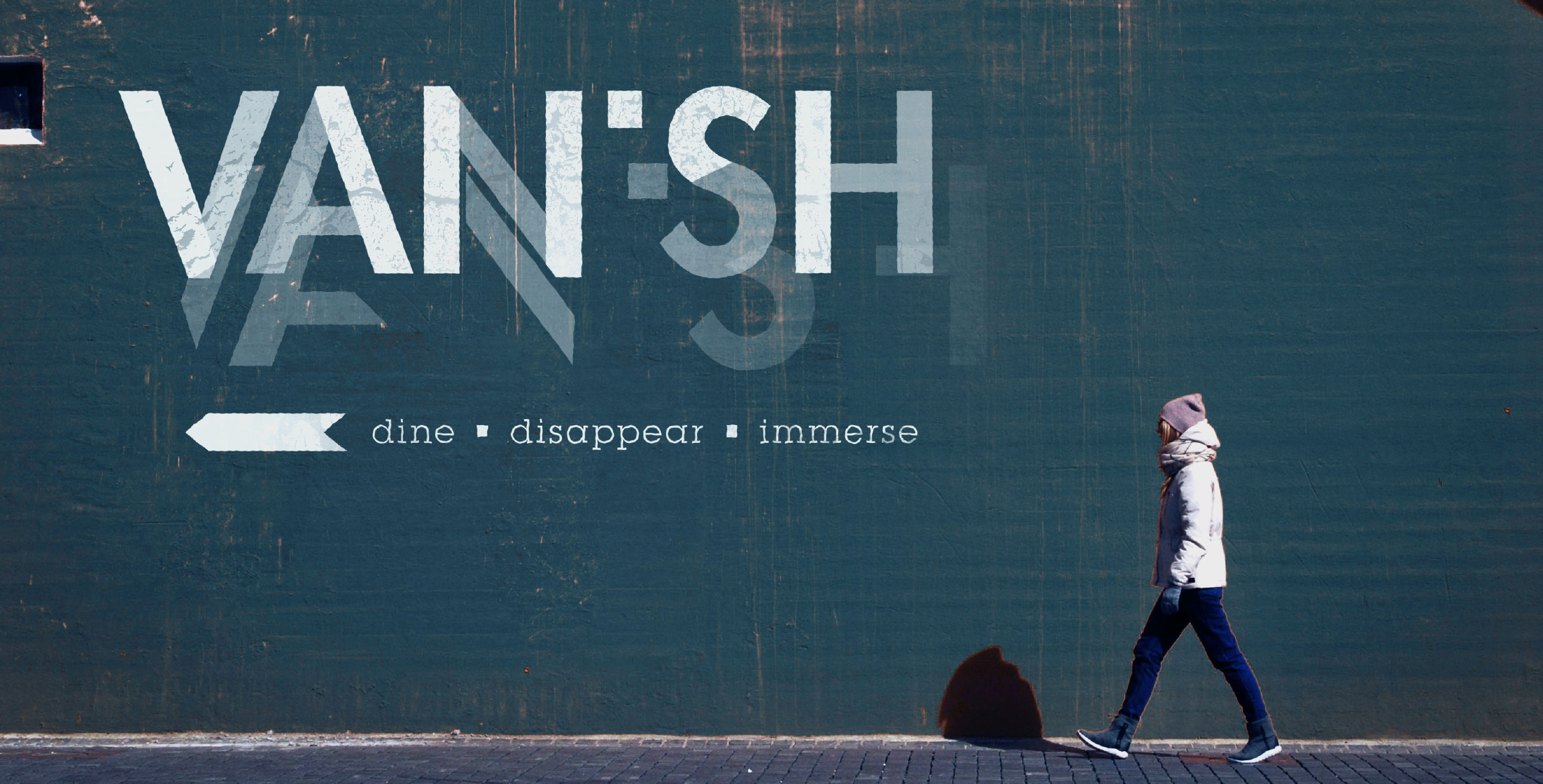
The final logo features “Vanish” with a missing “I” and fading reflection and could be simplified for mono-color representation. Two secondary typefaces were included along with the logotype to provide contrast to the san-serif. A muted palette was chosen to express the calming environment within the restaurant and the red was chosen to compliment the blues. The colors were tested for accessibility and contrast levels for web.
elevation & floorplan
The underground restaurant is comprised of 3 main sections: market, carry out pick up, and dining. The dining area features smaller seating options and curtains between each to provide and intimate, secluded, and quiet experience.
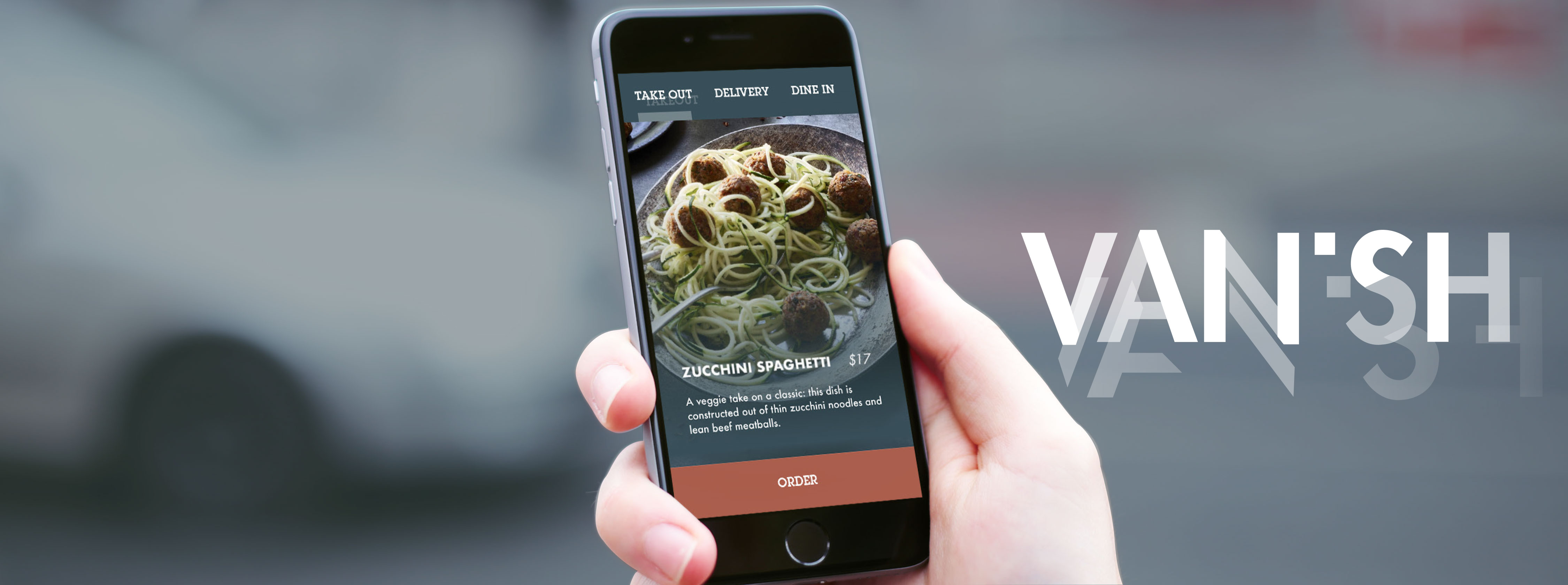
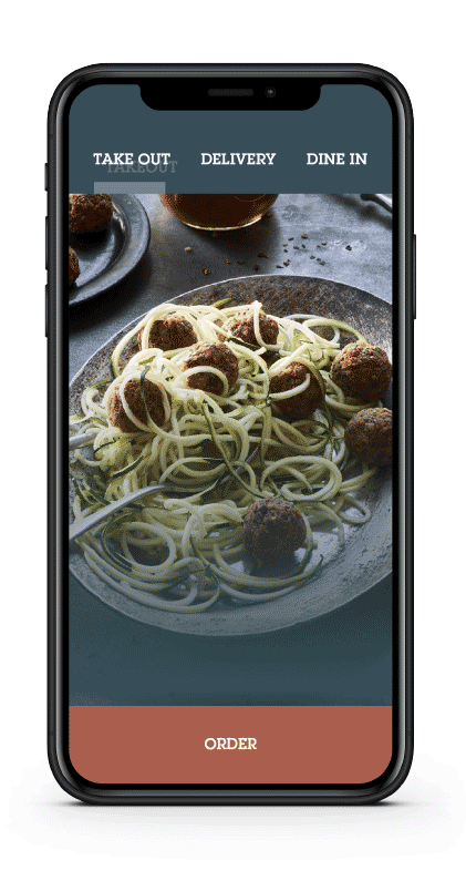
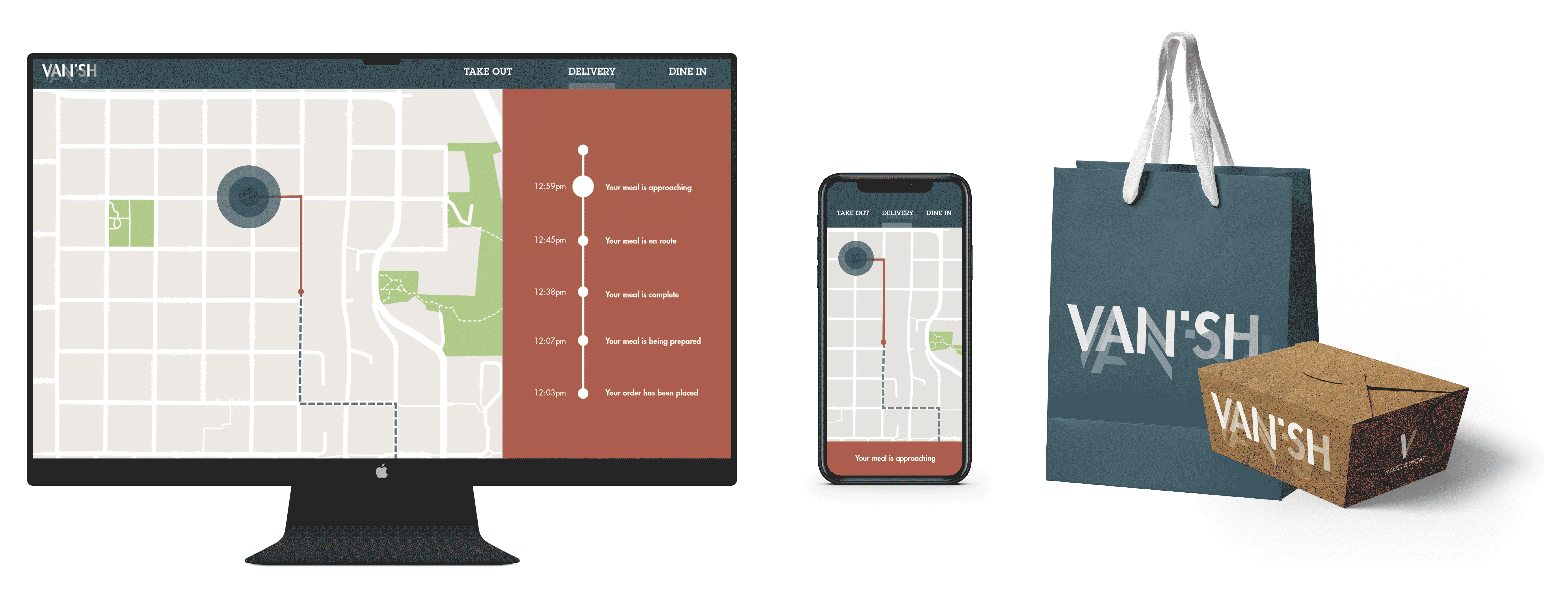
Digital Experience
The app serves 3 main functions: ordering for takeout, ordering for delivery, and creating reservations for dining in.
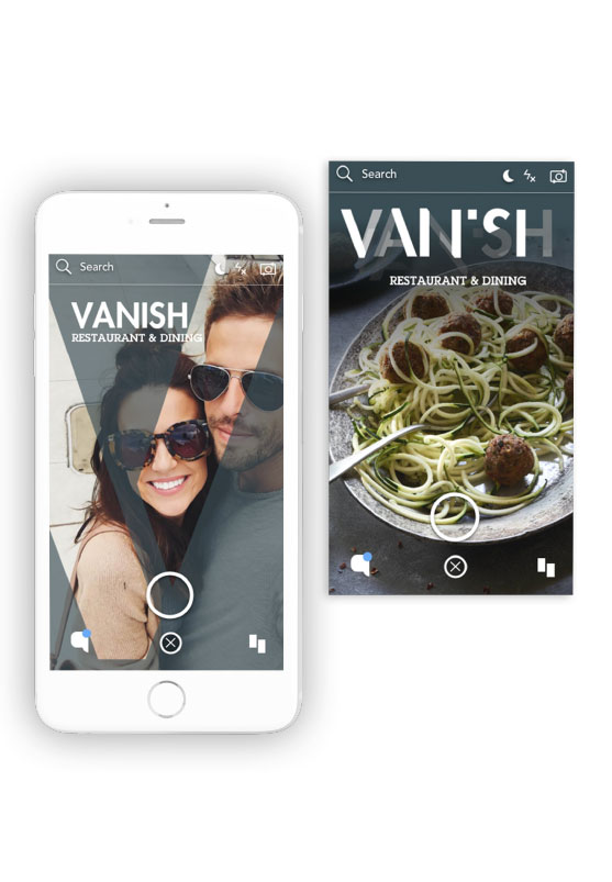
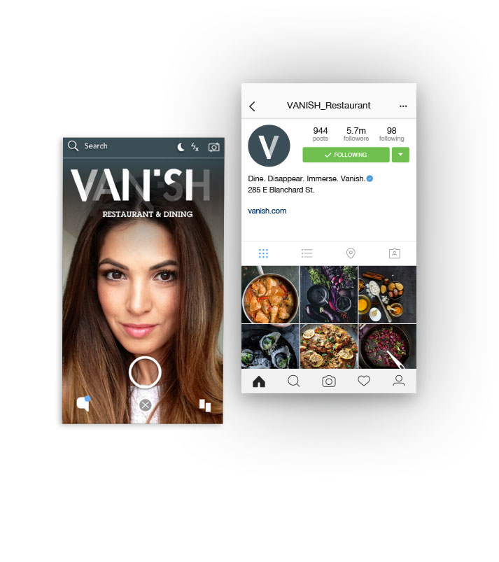
Social Media Engagement
Because the restaurant is underground and does not have a storefront to immediately attract new customers, a social media strategy was created. This would include geofilters that would appear within a close proximity to the restaurant and social media accounts hosted by Vanish.
Outdoor Signage
To follow the motif of analog elements, the outdoor signage and wayfinding would be a rough painted sign.
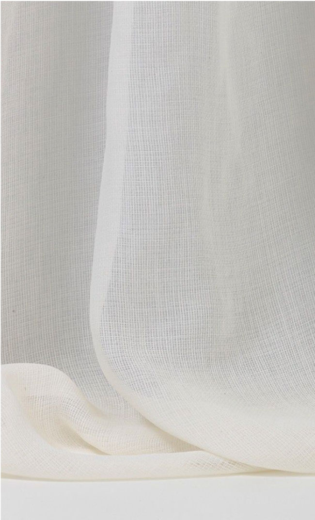
Mood & Texture
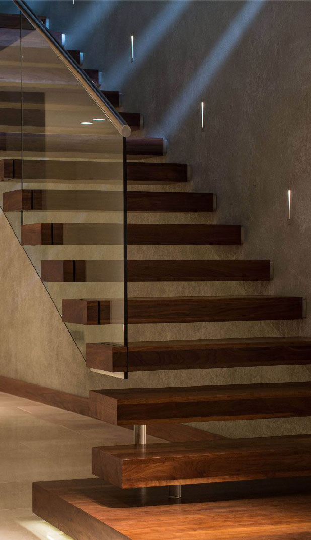
The stairs to the restaurant level would begin to indicate the softer and warmer elements the user will be immersed in once at Vanish.
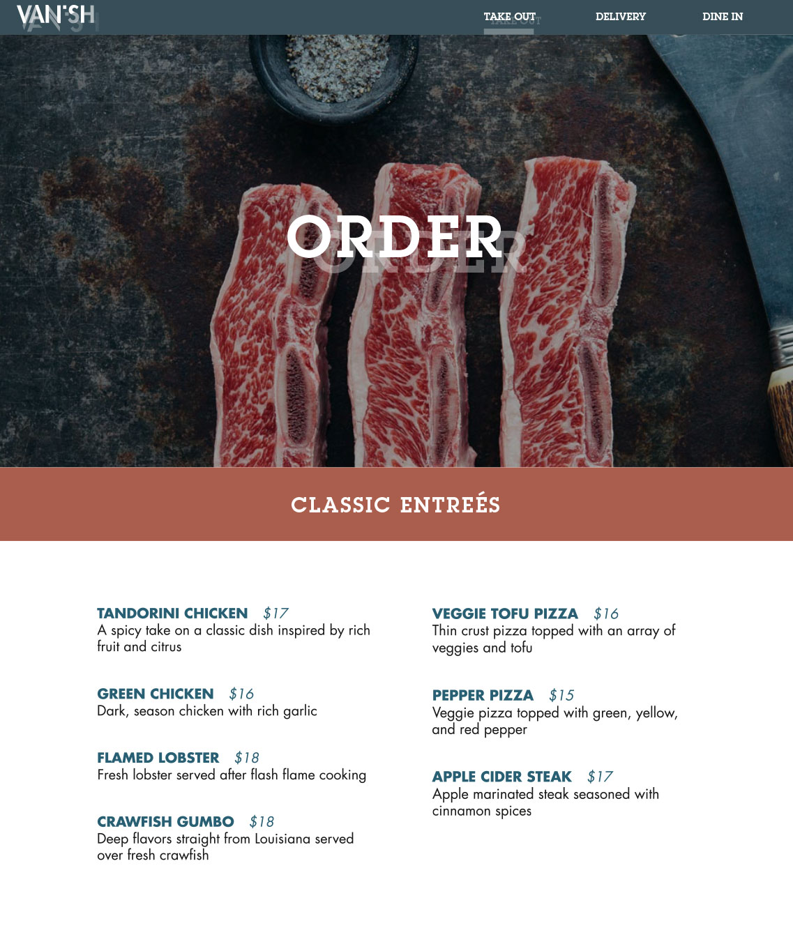
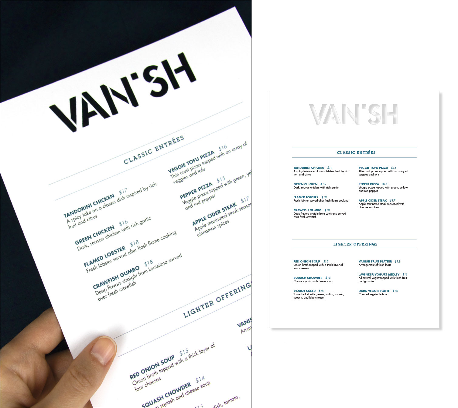
Menu
The physical menu has a die cut logo featured at the top to echo the concept of Vanishing to create a textural experience.
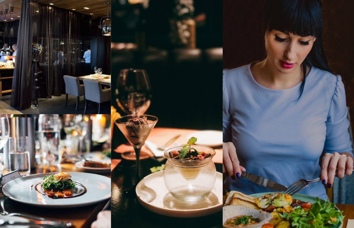
Dining Experience
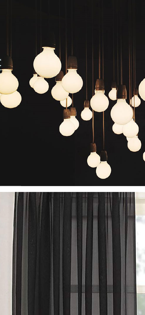
Once in the dining section, the user is presented with professionally plated dishes, surrounded by curtains and warm lighting.
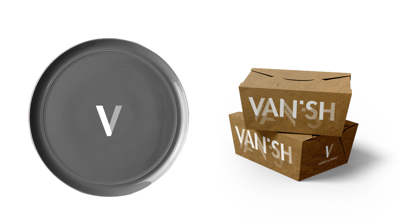
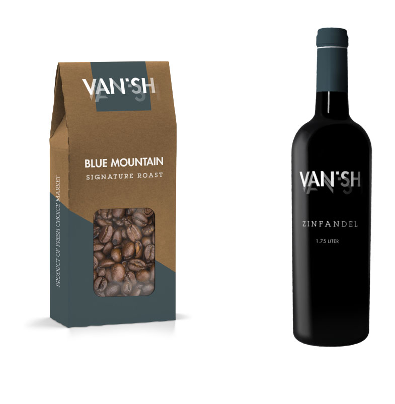
Brand Extension
As the user finishes their meal and exits the restaurant, they are able to bring a piece of the experience home with them through their takeout box and an assortment of brand products available at the market.
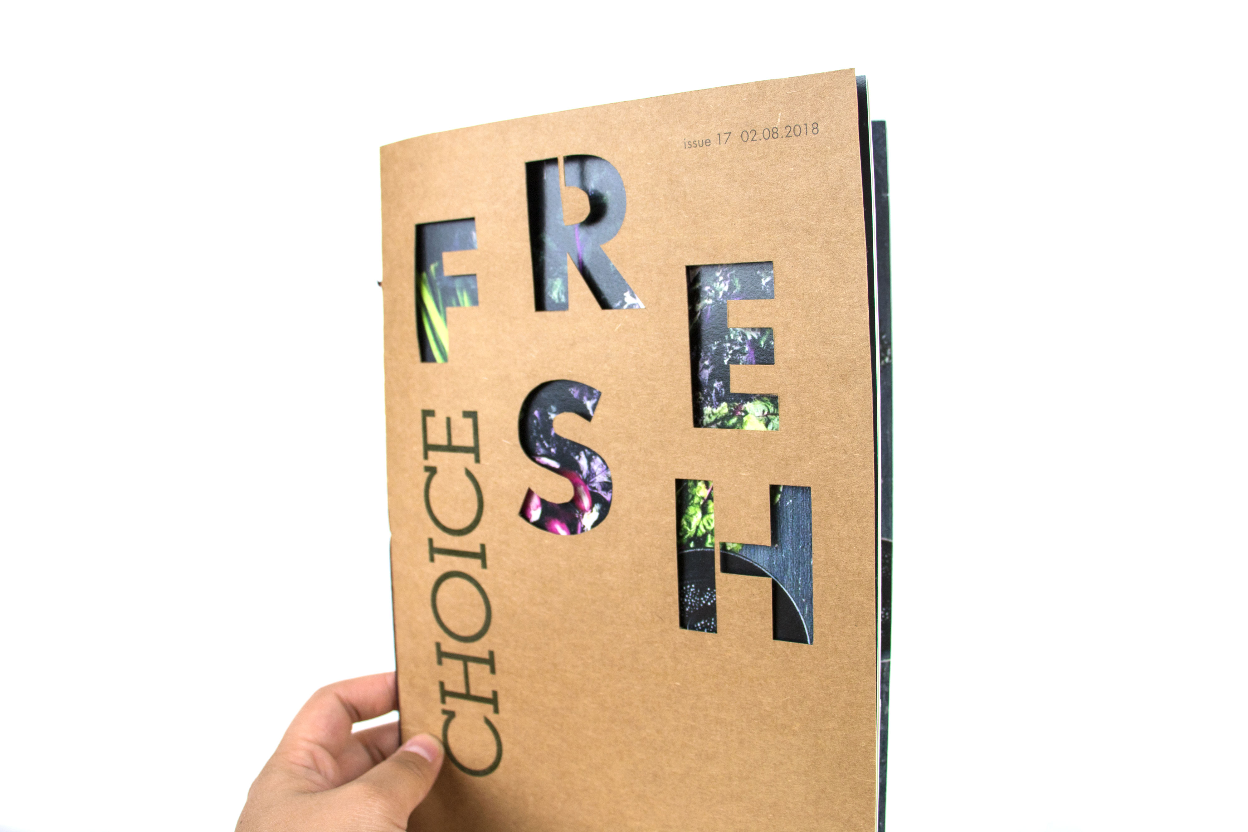
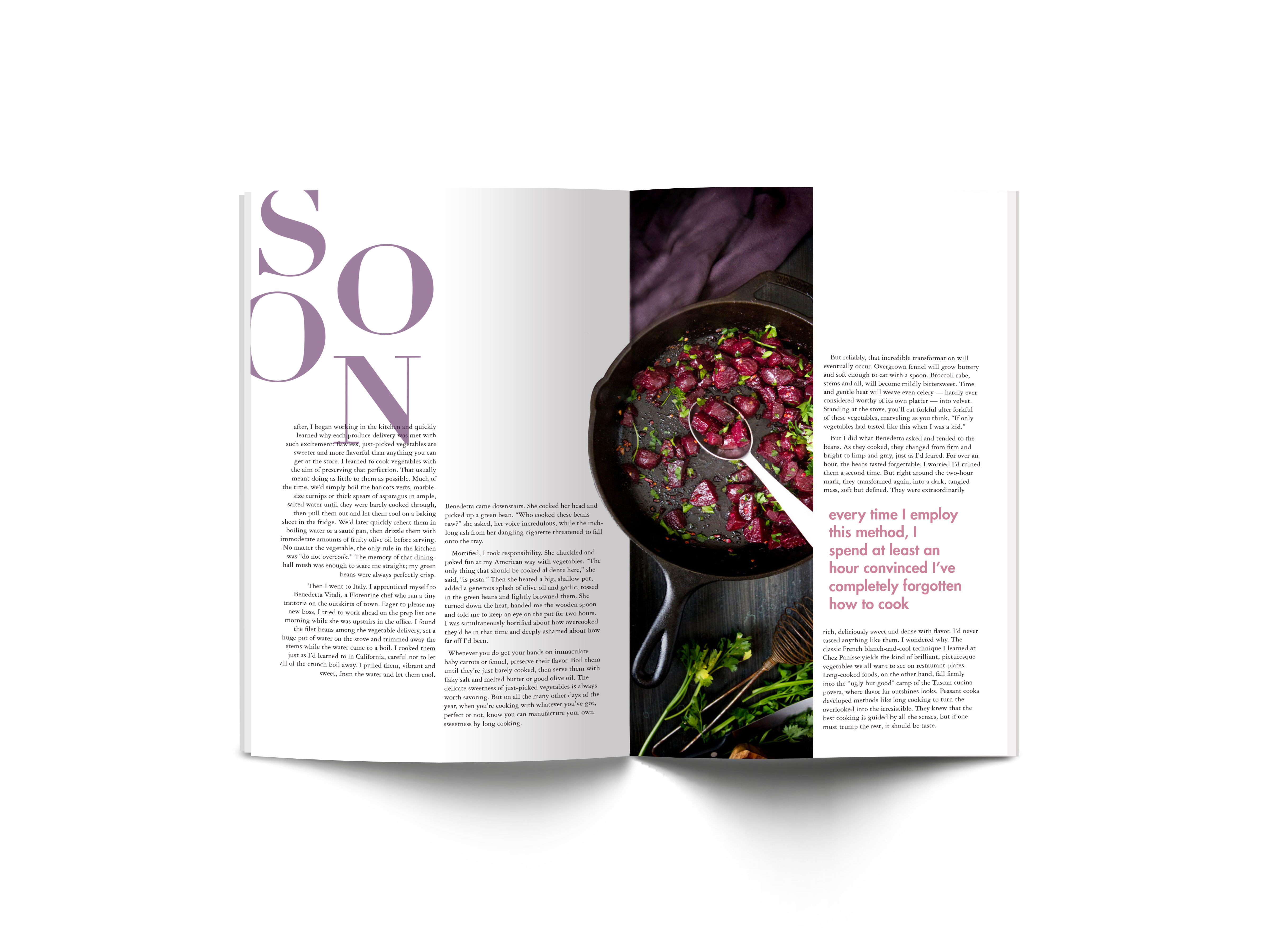
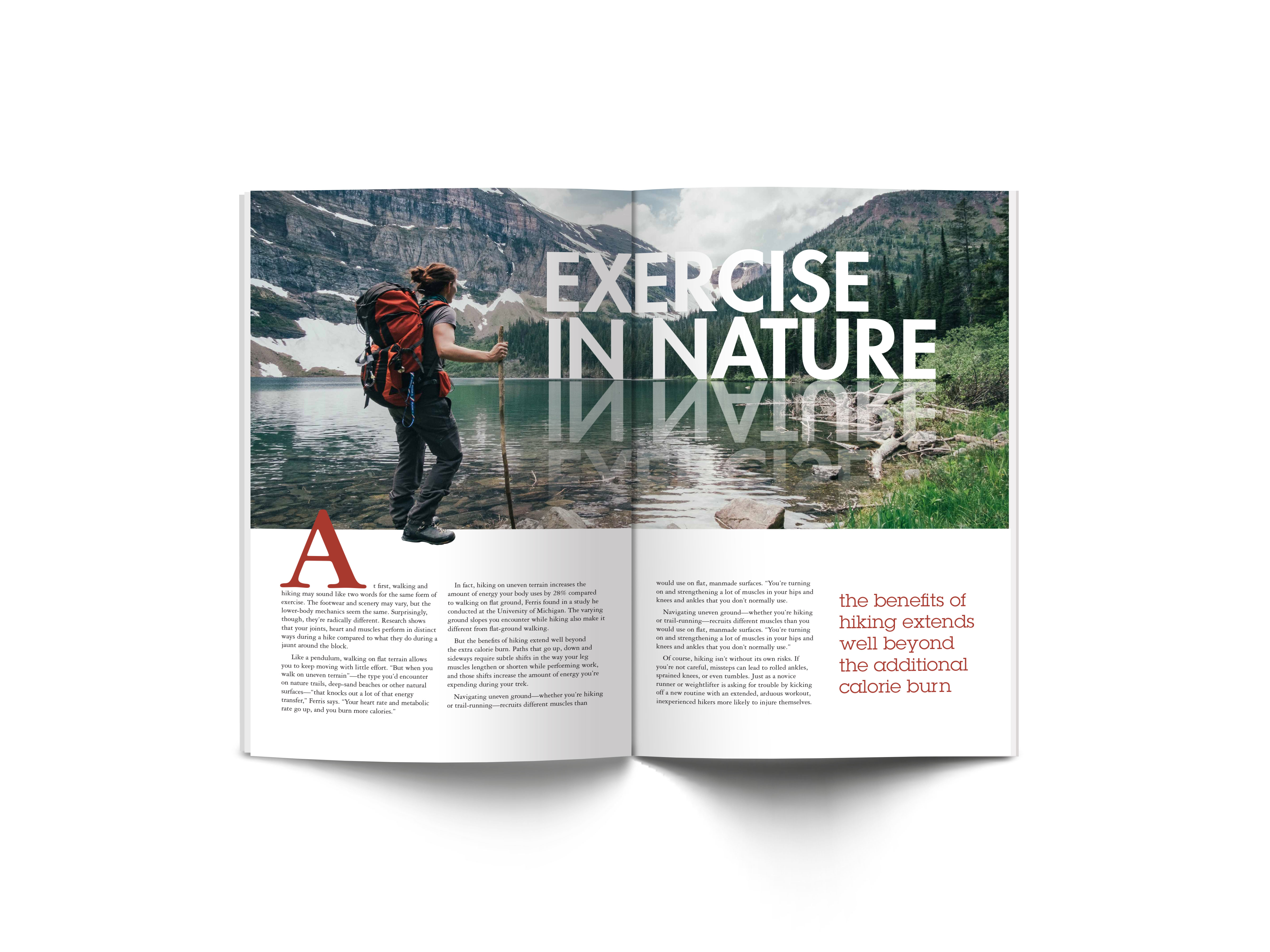
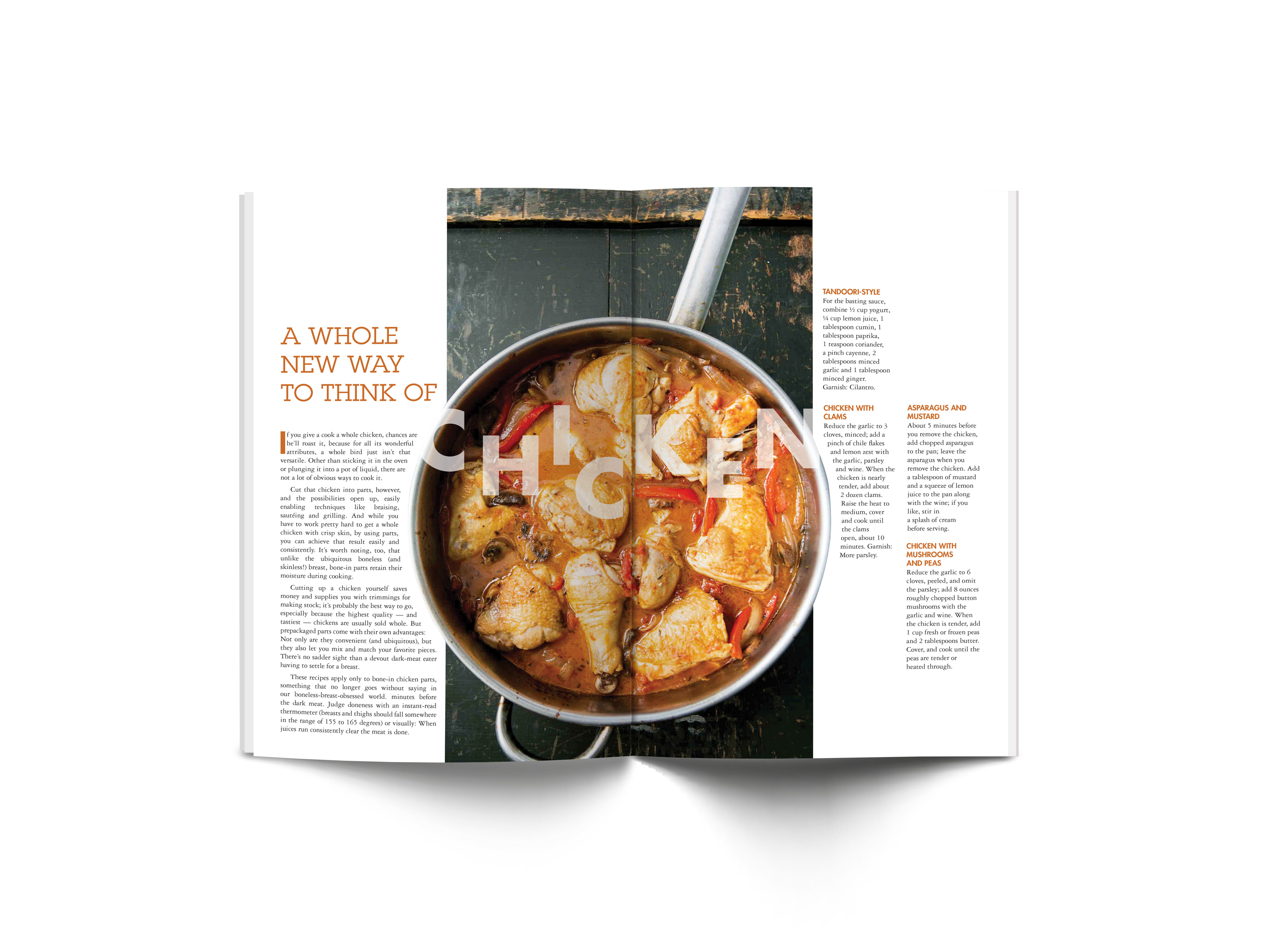
Fresh Choice Magazine
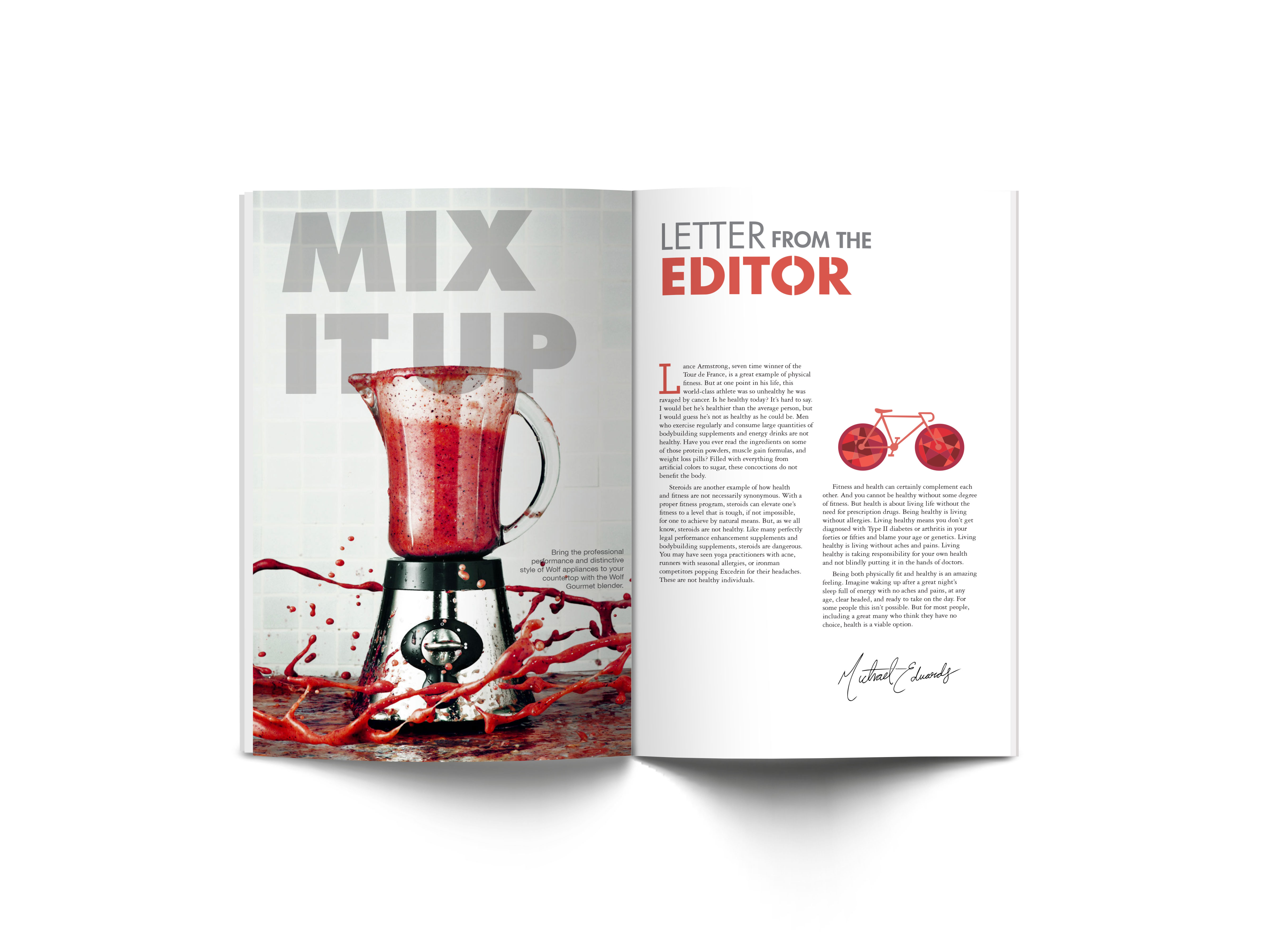
Fresh Choice is an editorial produced by Vanish that advocates a healthy lifestyle and diet while still enjoying sophisticated dishes.